
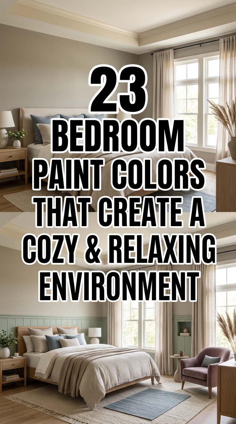
I repainted my bedroom four times before I got it right. Not exaggerating. The first time, I went with a bright white because everyone said it would “open up the space.” It did. It also made the room feel like a hospital waiting area. Cold, flat, nothing cozy about it at all.
Turns out, paint color isn’t just a decor choice — it actually changes how you feel in a room, and even how well you sleep in it. Once I understood that, choosing a color stopped feeling random and started feeling intentional.
If you’re staring at paint swatches right now, completely overwhelmed, I get it. There are just too many options. So I put together this list of 25 bedroom paint colors that actually create a cozy, calm feeling — grouped by mood and style, so you can find your match faster instead of scrolling through a random list.
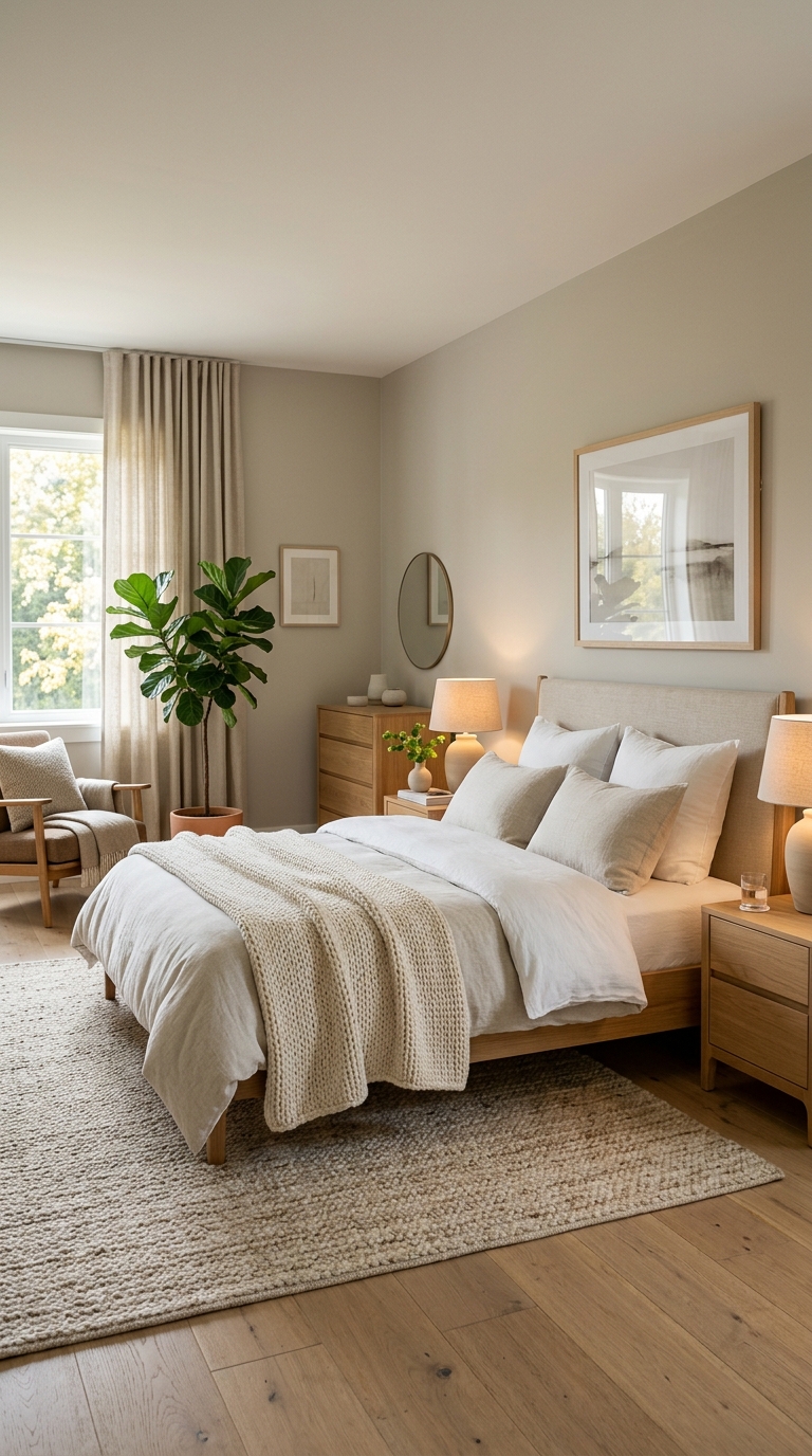
Before we jump into the colors, here’s a quick snapshot of what actually matters when picking one:
- Light matters more than the color itself. The same swatch can look totally different in a north-facing room versus a sunny south-facing one.
- Warm feels cozy; cool feels calm. Neither is “better” — it depends on the vibe you’re going for.
- Undertones can trick you. A gray can secretly lean blue, green, or purple once it’s on your actual wall.
- Finish changes the whole feel too, not just the color — more on that further down.
Quick Picks (If You’re in a Hurry)
- Best for small bedrooms: Creamy White
- Best for couples/shared bedrooms: Deep Teal
- Best bold, moody pick: Charcoal Gray
- Best all-around safe neutral: Greige
- Best for better sleep: Dusty Blue
How to Choose the Right Bedroom Paint Color
Before you grab a paint can, a couple of things are worth thinking about first.
Room size and natural light matter more than you’d think.
A dark, moody color can look stunning in a big bedroom with tons of natural light, but the same color in a small, dim room might feel closed-in rather than cozy. If your bedroom doesn’t get much sun, lean toward warmer, lighter shades.
Warm tones generally feel cozier; cool tones feel calmer.
This isn’t a strict rule, but it’s a helpful starting point. Warm colors (beige, terracotta, warm gray) feel inviting and snug. Cool colors (blue, sage, seafoam) feel peaceful and soothing, more like a spa than a hug.
Always test the undertone before committing.
This is the step most people skip, and it’s the one that causes the most regret. Paint a sample swatch directly on your wall and look at it at different times of day — morning light, afternoon, and with your lamps on at night. A color can look completely different under each.
Warm & Cozy Neutrals
These are the safest, most versatile picks — great if you want a room that feels warm without being too bold. Neutrals also tend to age well, so you’re less likely to feel tired of them in a year or two.
1. Creamy White
A soft, creamy white keeps a room feeling open and airy without going cold. It works with almost any decor style, from modern to boho, and reflects light beautifully — which makes it a smart pick if your bedroom is on the smaller side. It’s also one of the easiest colors to build on later, since almost any bedding or accent color slots right in.
Once you’ve picked your palette, bring it all together with our Dreamy Bedroom Ideas for Couples guide.
- Mood: Airy, clean, calm
- Best for: Small or dark bedrooms
- Pairs well with: Natural wood, linen, soft gold accents
2. Warm Gray
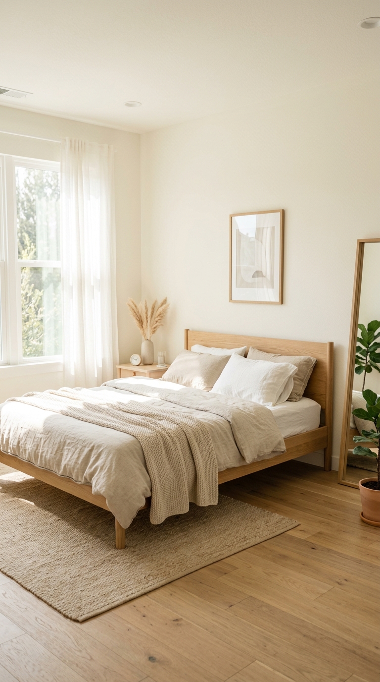
Warm gray, with just a hint of beige mixed in, feels far more inviting than a flat, cool gray. It gives the room a settled, secure feeling and pairs beautifully with gold or brass accents. It’s a good middle-ground pick if you like gray but worry it’ll feel too cold.
- Mood: Grounded, sophisticated
- Best for: Master bedrooms, modern styles
- Pairs well with: Brass, dark wood, cream textiles
3. Greige
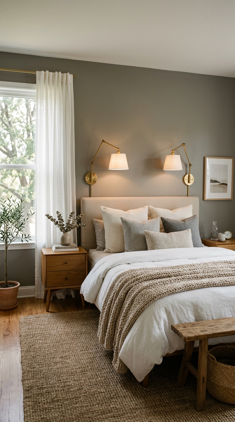
Greige — that perfect in-between of gray and beige — might be the most forgiving color on this whole list. It looks modern, it looks warm, and it somehow works in almost any lighting condition, which makes it a favorite for master bedrooms. If you genuinely can’t decide between warm and cool, this is usually the safe answer.
Want warm, seasonal tones? Explore our Fall Bedroom Decor Ideas for inspiration.
- Mood: Balanced, modern, warm
- Best for: Any room, especially if you’re unsure of your style
- Pairs well with: Almost everything — a true chameleon color
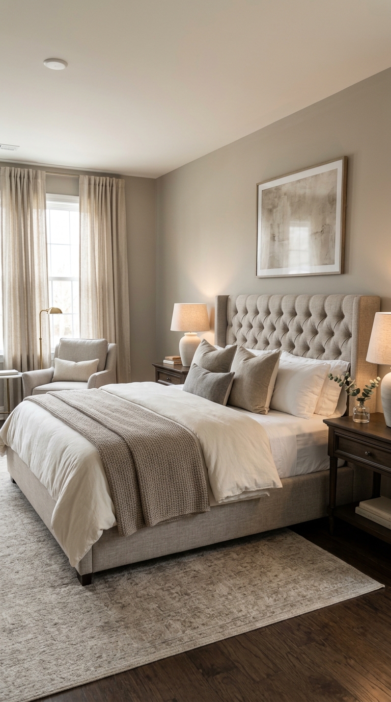
4. Soft Beige
Soft beige is that gentle, dependable color that never feels sterile but never feels overwhelming either. It’s a blank canvas that lets your furniture and decor do the talking, which is great if you like switching up your bedding or art often.
- Mood: Gentle, welcoming
- Best for: People who like to redecorate often
- Pairs well with: Almost any accent color
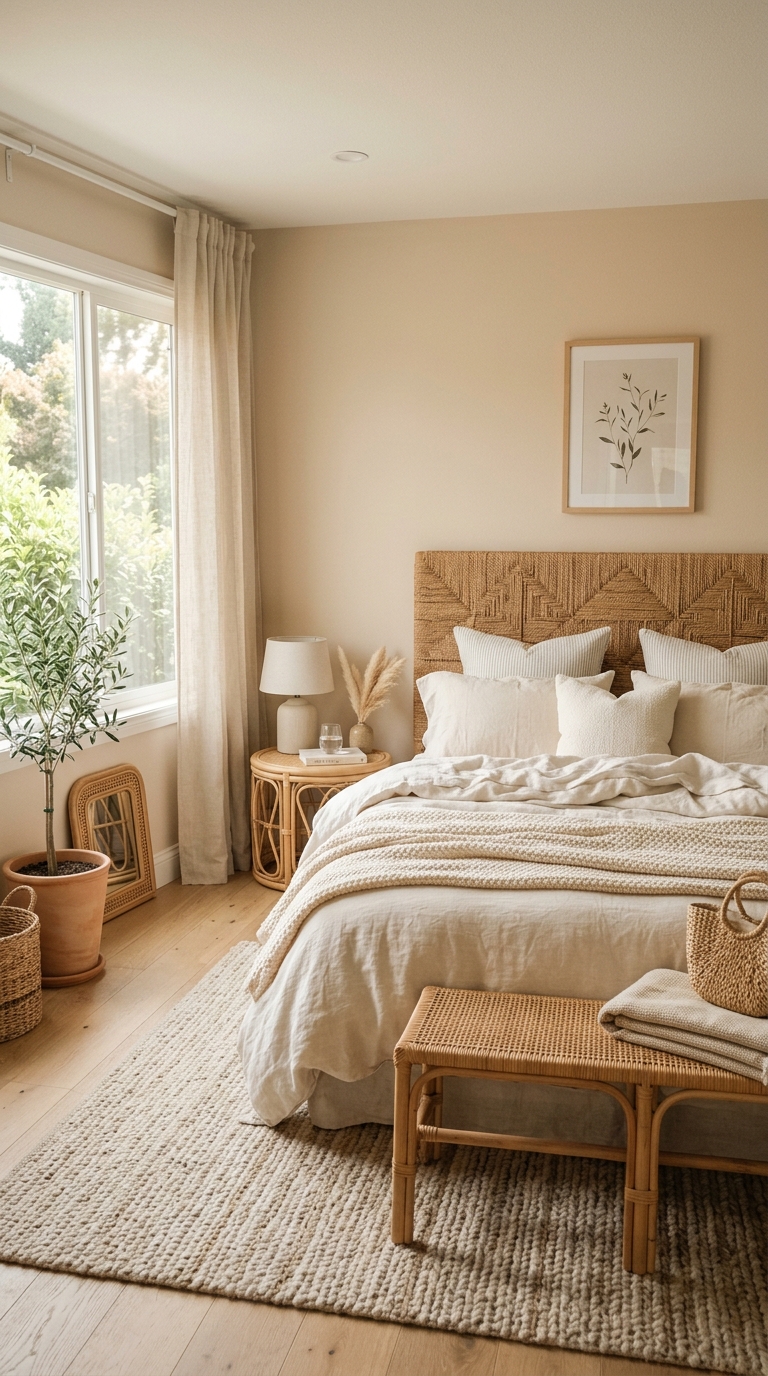
5. Muted Clay
Muted clay brings a warm, handmade, almost rustic feel into a room. It looks especially good in spaces with plenty of natural light, since the tone seems to shift and glow throughout the day, going a bit deeper as the light fades in the evening.
Renting your space? These Renter-Friendly Bedroom Decorating Ideas show you how to add color without damaging walls.
- Mood: Earthy, rustic, warm
- Best for: Sunlit rooms, boho or rustic-modern styles
- Pairs well with: Deep greens, rich browns, warm grays
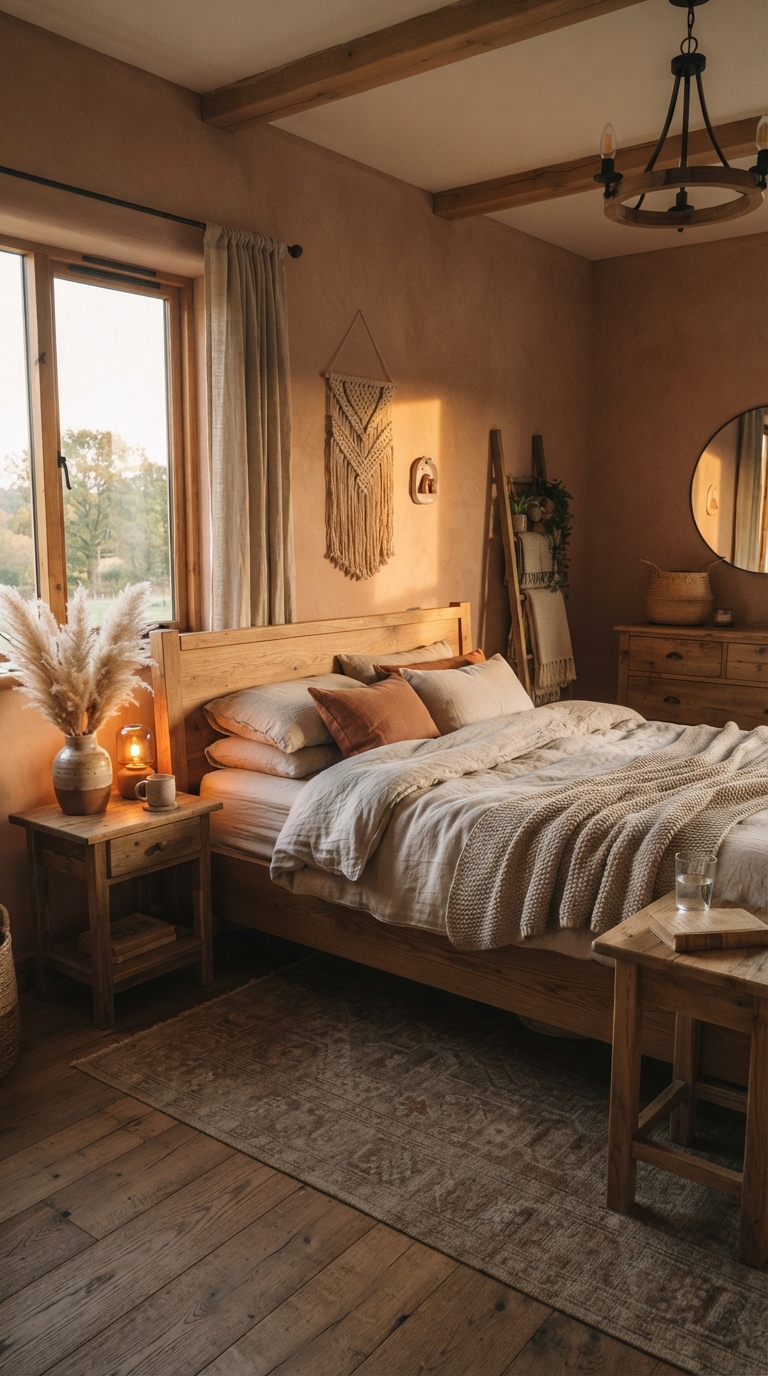
Calming Cool Tones
If your goal is pure relaxation — think spa-like, not cozy-cabin — these shades are worth a look. They tend to work especially well if your bedroom faces the sun and gets a lot of warm light, since the coolness balances things out.
6. Dusty Blue
Dusty blue, with a soft gray undertone, feels like looking up at an overcast sky — calm, quiet, easy on the eyes. It’s one of the top colors recommended for better sleep, and it pairs beautifully with crisp white trim.
- Mood: Peaceful, restful
- Best for: Anyone prioritizing sleep quality
- Pairs well with: White trim, light wood, linen textures
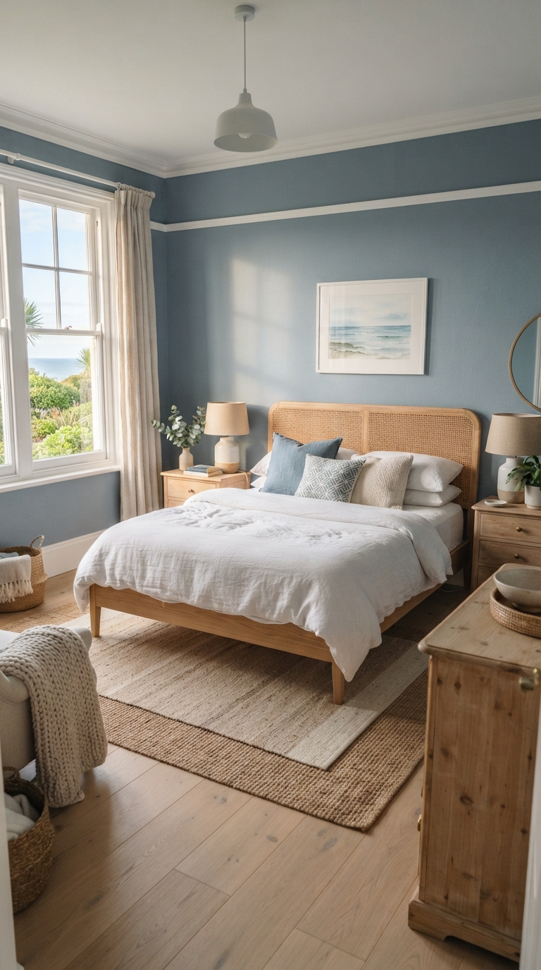
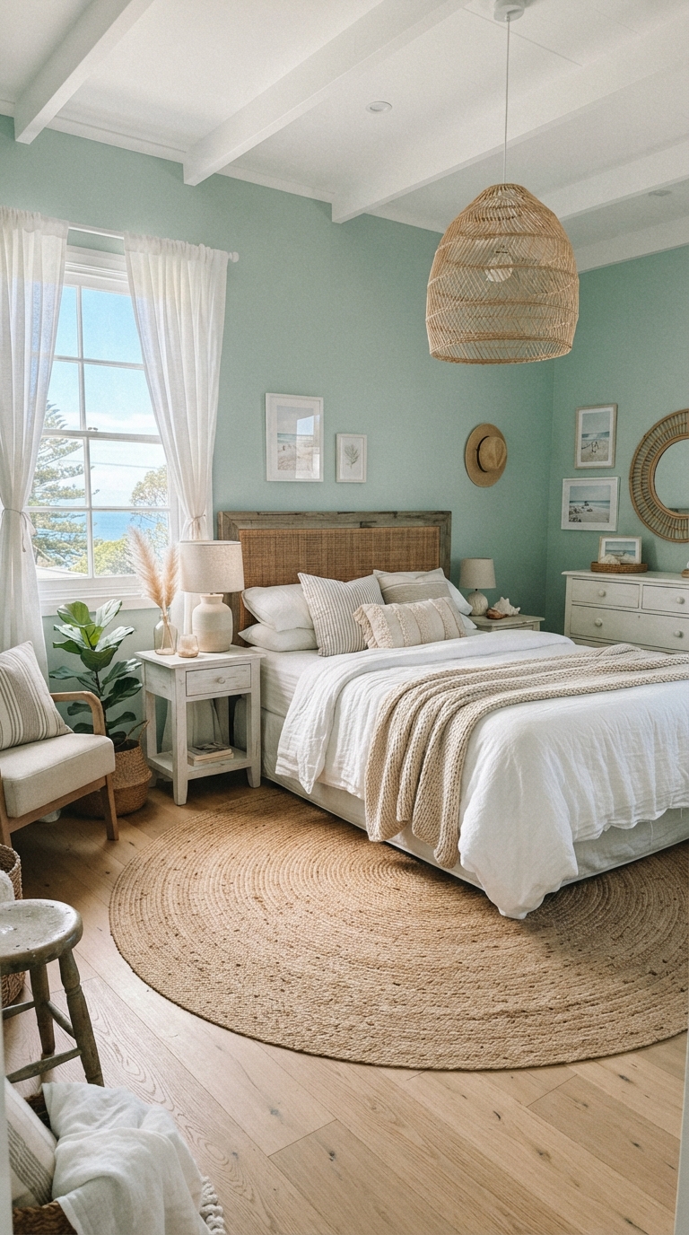
7. Seafoam Green
Seafoam green brings a light, breezy, coastal feel into a bedroom. It pairs beautifully with whites, light grays, and natural fiber textures like jute or rattan, and it tends to feel fresh rather than cold.
- Mood: Breezy, fresh, coastal
- Best for: Bright rooms, beach-inspired decor
- Pairs well with: White, light gray, natural fibers
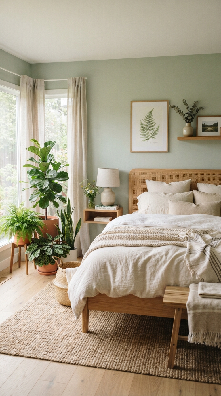
8. Light Sage Green
Light sage green feels like bringing a bit of nature indoors — muted, earthy, and easy to live with. It works equally well in rustic and modern bedrooms, and it’s one of those rare colors that photographs beautifully in almost any lighting.
Prefer a softer, coastal palette? Check out our Coastal Granddaughter Bedroom Ideas for the perfect color pairings.
- Mood: Grounded, natural, calm
- Best for: Nature-inspired or modern rooms alike
- Pairs well with: Natural wood, linen, cream tones
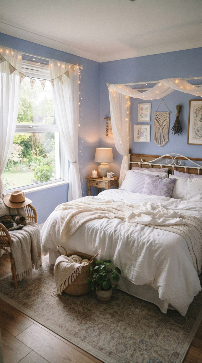
9. Periwinkle
Soft periwinkle sits somewhere between blue and purple, and it genuinely changes character depending on the light in the room. In a bedroom with lots of natural light, it can look dreamy and almost whimsical, while in dimmer light it leans a bit more moody and blue.
- Mood: Dreamy, whimsical
- Best for: Bright rooms, guest bedrooms
- Pairs well with: White, soft lavender, brushed silver
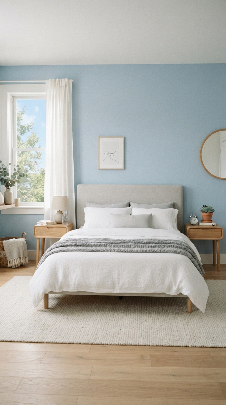
10. Powder Blue
Powder blue is a lighter, softer cousin of dusty blue — gentle, quiet, and easy to pair with almost any bedding color. It’s a reliable pick if you want calm without any drama, and it works nicely in rooms that don’t get a ton of natural light.
- Mood: Soft, quiet, gentle
- Best for: Low-light rooms, minimalist styles
- Pairs well with: White, gray, soft wood tones
Romantic & Soft Tones
These shades add warmth and a touch of romance without going overly bold or feminine. They tend to work especially well for shared bedrooms, since they feel warm without leaning too “girly” or too plain.
Thinking teal? Get full styling inspiration in our Teal Bedroom Ideas guide.
11. Soft Rose
Soft rose, with just a hint of gray, is a modern, grown-up take on pink. It’s comforting rather than sweet, and it pairs beautifully with brass or black accents for a bit of contrast.
- Mood: Warm, comforting, modern
- Best for: Couples, shared bedrooms
- Pairs well with: Brass, black, cream
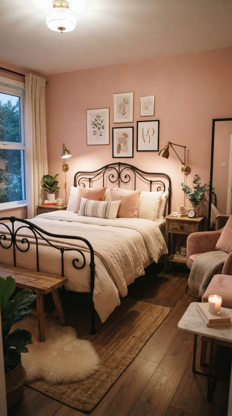
12. Mauve
Mauve blends pink and gray into something that feels timeless rather than trendy. It’s calming, a little romantic, and works surprisingly well with both white and charcoal accents.
- Mood: Calm, romantic, timeless
- Best for: Master bedrooms, romantic styling
- Pairs well with: White, charcoal, soft wood
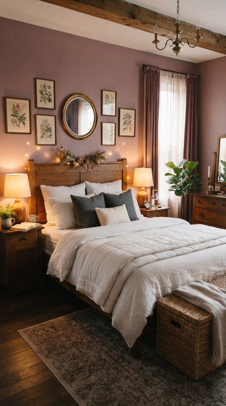
13. Pale Blush
Pale blush is subtle enough that it barely reads as “pink” at all — just a warm, gentle glow on the walls. It pairs beautifully with white, gold, and natural wood tones, and it’s a nice option if you want warmth without much color commitment.
- Mood: Warm, subtle, gentle
- Best for: Anyone hesitant about using color
- Pairs well with: White, gold, natural wood
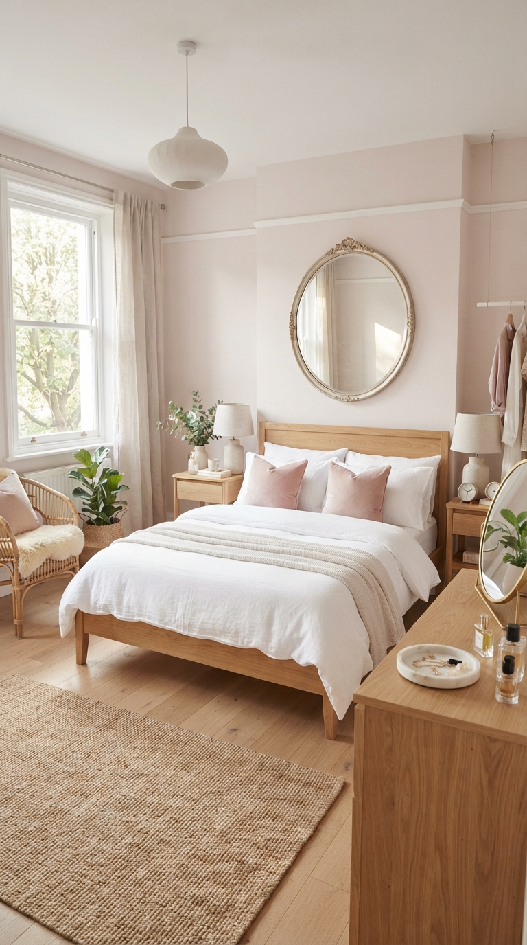
14. Lilac
Soft lilac adds a gentle pop of color without overwhelming the room. It has a peaceful, slightly romantic feel that works especially well for a dreamy, ethereal bedroom style, and it’s a nice option for a guest room too.
- Mood: Peaceful, dreamy, romantic
- Best for: Guest rooms, soft romantic styling
- Pairs well with: White, lavender, soft gray
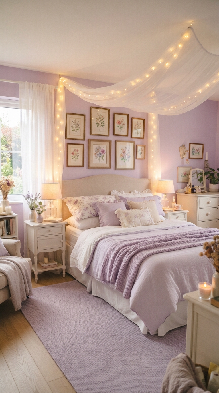
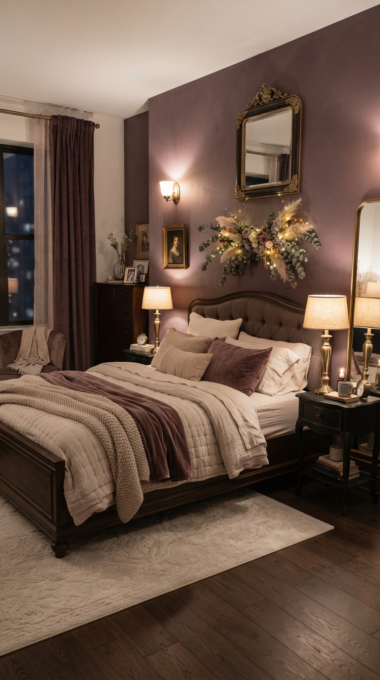
15. Dusty Plum
Dusty plum offers a deeper, richer take on the romantic color family — moody yet soft. It works beautifully as an accent wall behind the bed for a bit of drama without going too dark for the whole room.
- Mood: Rich, moody, romantic
- Best for: Accent walls, statement headboards
- Pairs well with: Cream, brass, warm wood
Bold & Moody Statement Colors
Not for the faint of heart, but these colors create serious depth and coziness when done right. The trick with all of these is texture — velvet, wool, warm lighting — so the room feels rich instead of just dark.
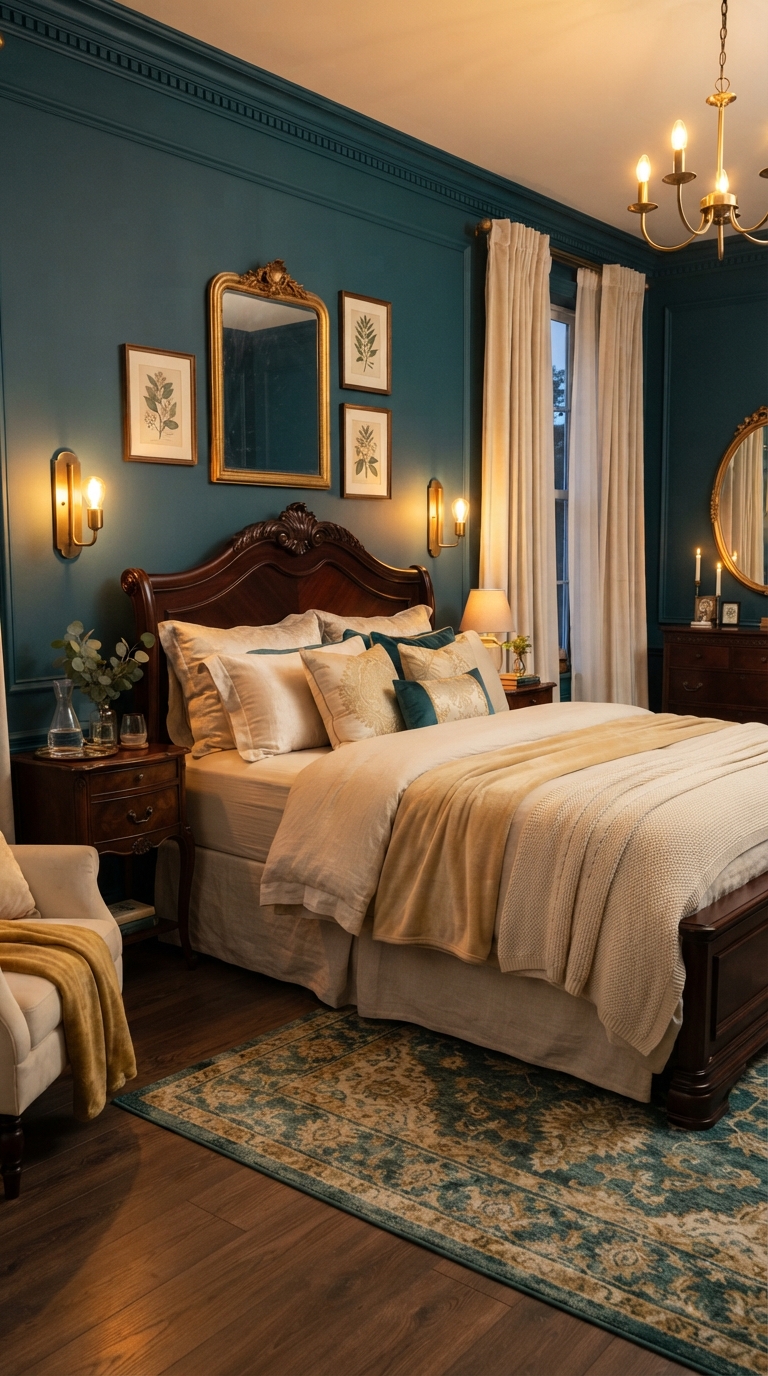
16. Deep Teal
Deep teal is rich, soothing, and bold all at once — a color that makes a statement without feeling over the top. It pairs beautifully with brass fixtures and dark wood furniture, which makes it a favorite for couples wanting a romantic, grown-up bedroom.
- Mood: Rich, soothing, bold
- Best for: Couples, statement walls
- Pairs well with: Brass, dark wood, cream
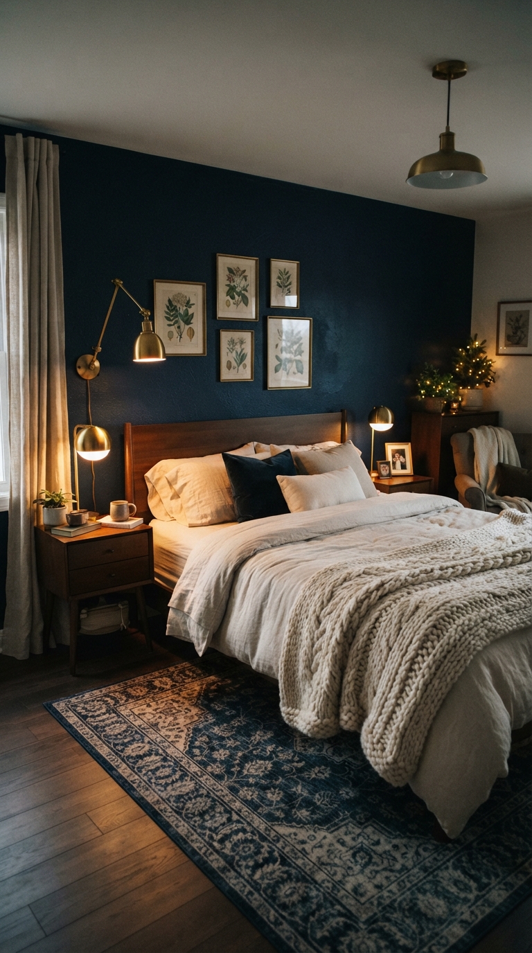
17. Navy Blue
Dark navy blue turns a bedroom into an intimate, almost luxurious retreat. It’s especially striking on an accent wall, paired with warm lighting and soft textures to keep it from feeling too heavy.
- Mood: Intimate, luxurious
- Best for: Accent walls, master bedrooms
- Pairs well with: Brass, cream, warm wood
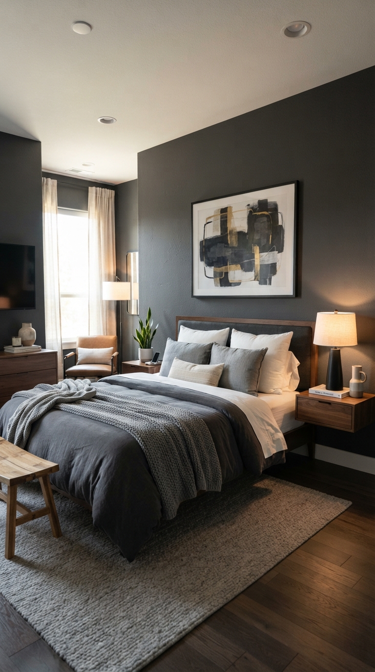
18. Charcoal Gray
Charcoal gray is deep and dramatic, but somehow still incredibly cozy when paired with the right textures. It’s a sophisticated alternative to full black and makes a great backdrop for bold wall art.
- Mood: Dramatic, sophisticated
- Best for: Modern bedrooms, bold decor lovers
- Pairs well with: White, bold art, warm lighting
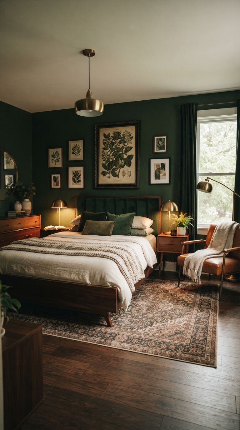
19. Forest Green
Forest green brings the calm of a deep, lush woodland straight into your bedroom. It’s rich without being loud and pairs beautifully with dark wood and leather accents for a grounded, almost cabin-like feel.
- Mood: Grounded, rich, calm
- Best for: Nature lovers, cozy cabin styling
- Pairs well with: Dark wood, leather, brass
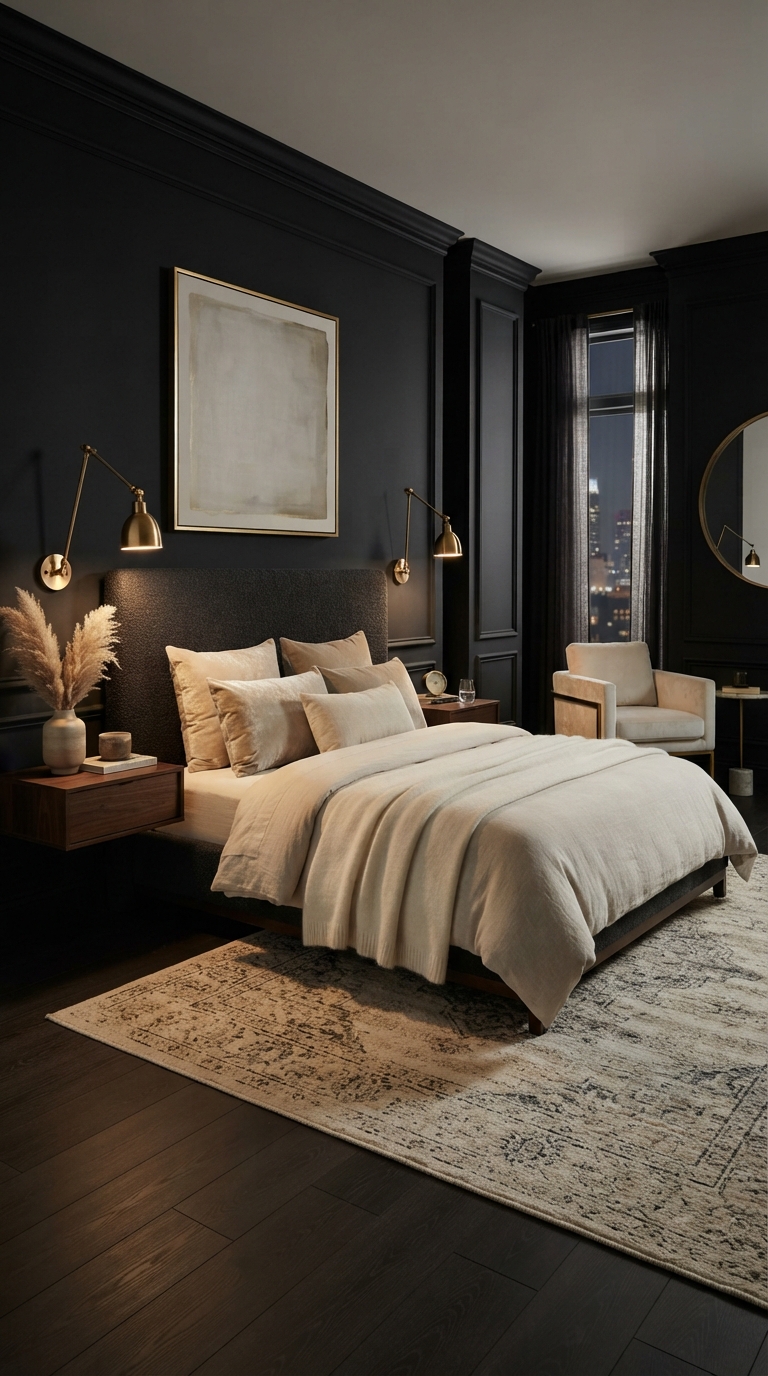
20. Black
Black walls sound intense, but done right, they create a cocoon-like, hotel-suite kind of luxury. The key is layering in plenty of texture — velvet, wool, linen — so the room still feels warm instead of stark.
- Mood: Dramatic, cocooning, luxurious
- Best for: Bold decor lovers, big rooms with good lighting
- Pairs well with: Velvet, brass, cream textures
Earthy & Warm Accents
Perfect if you want a bedroom that feels grounded, sun-baked, and full of warmth. These shades work especially well as accent walls if you’re not ready to commit to a full room.
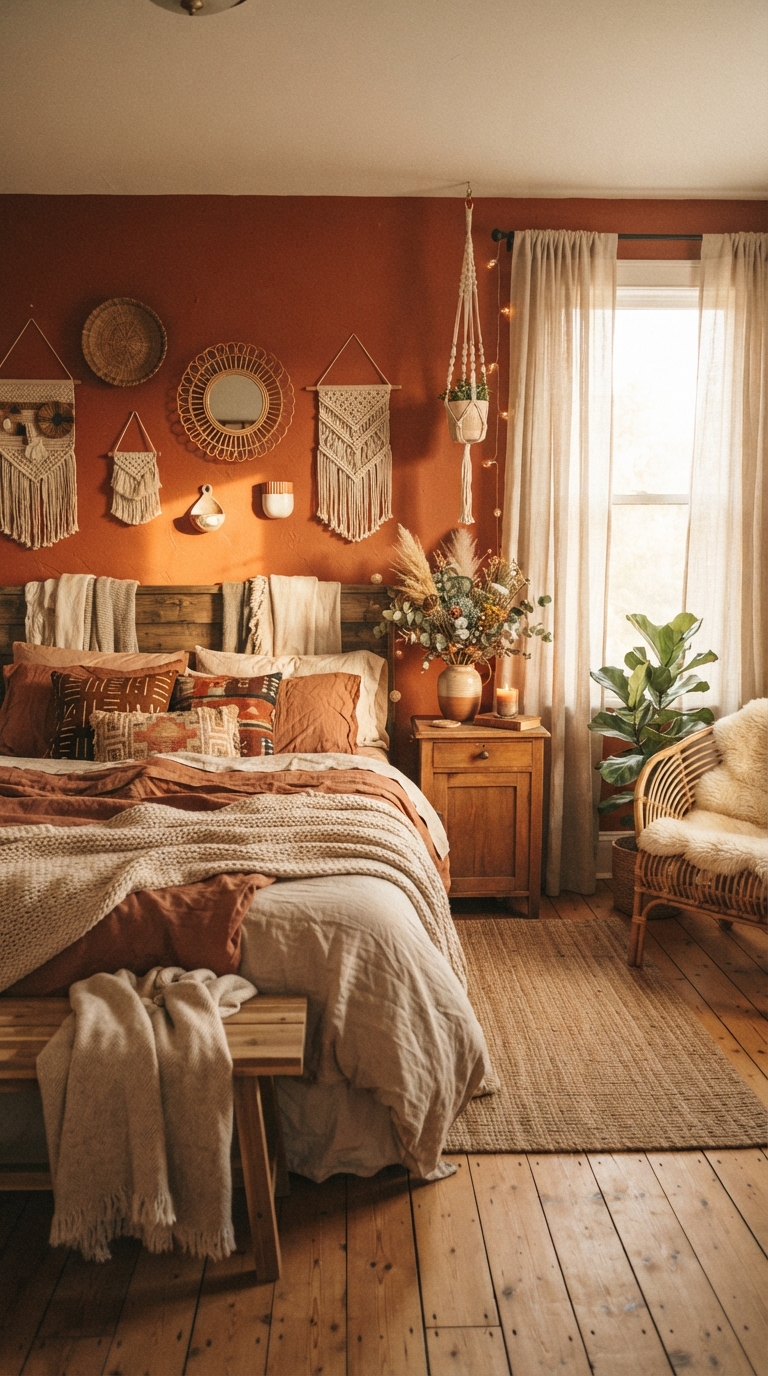
21. Terracotta
Terracotta has that warm, sun-baked quality that instantly makes a room feel grounded and inviting. It works beautifully in rooms with a boho or rustic-modern style, and it looks even better as the light shifts throughout the day.
- Mood: Warm, grounded, sun-baked
- Best for: Boho and rustic-modern rooms
- Pairs well with: Warm tones, woven textiles, wood
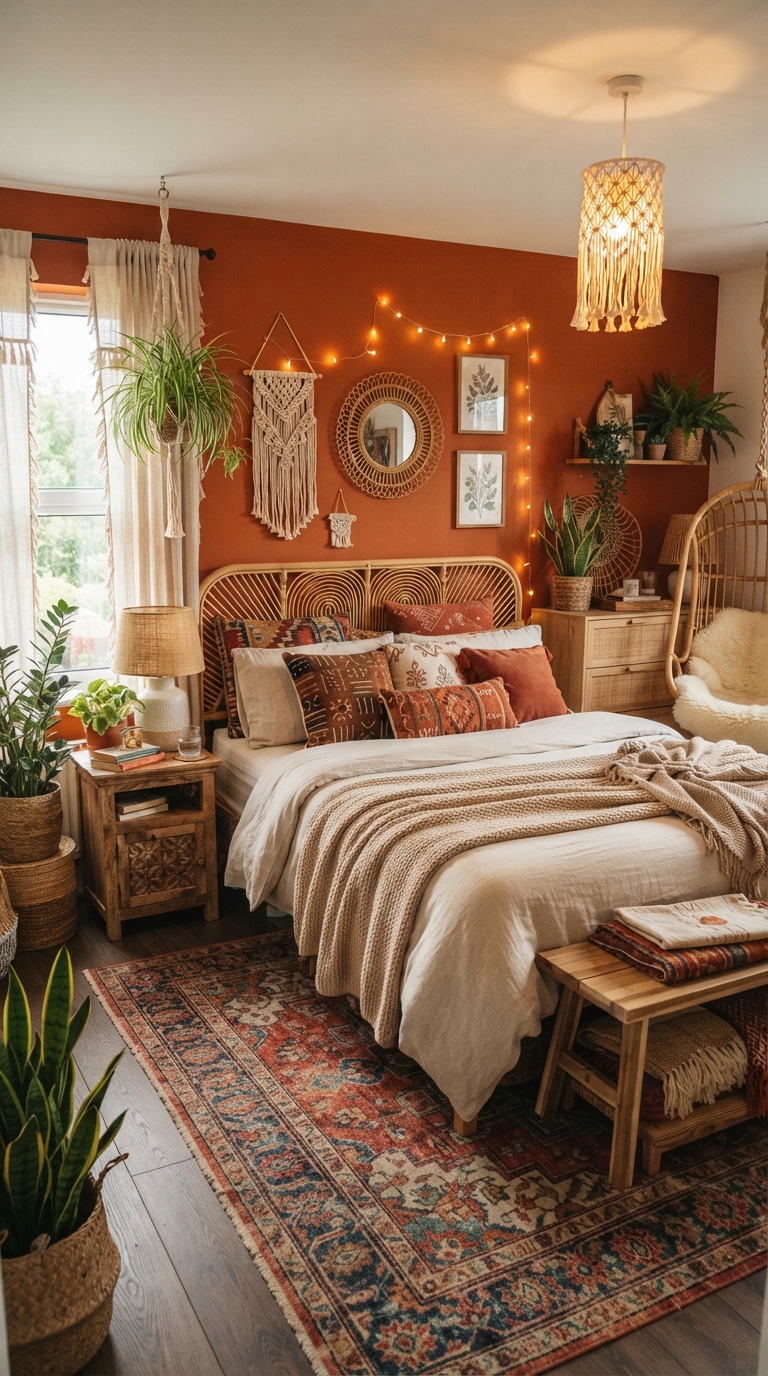
22. Burnt Orange
Burnt orange is bold and energetic, best used as an accent wall rather than to cover the whole room. Paired with deep browns and natural textures, it creates a warm, bohemian-inspired feel without becoming too loud.
- Mood: Energetic, warm, bold
- Best for: Accent walls, boho styling
- Pairs well with: Deep brown, natural texture
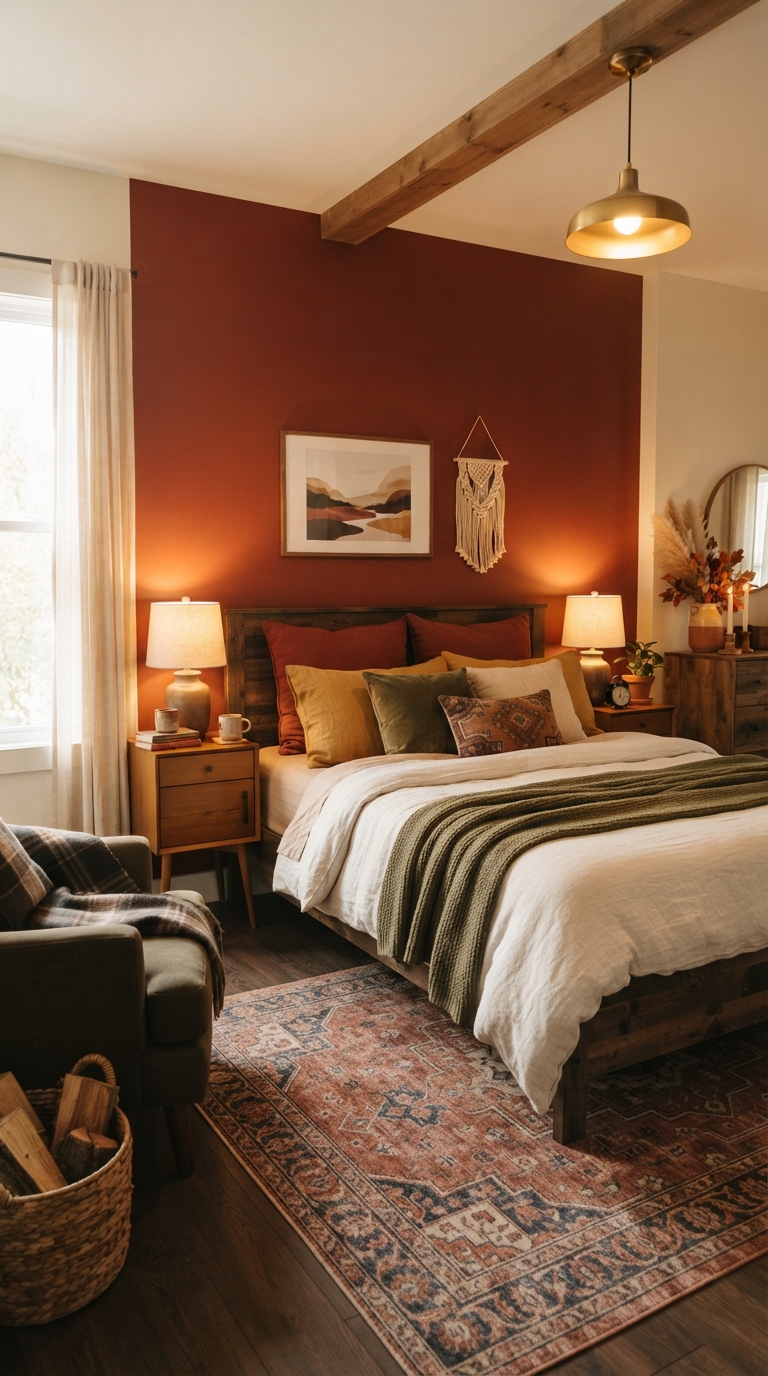
23. Rust Red
Rust red is deep, warm, and grounding — a slightly more subdued cousin of burnt orange. It looks incredible paired with mustard, olive, or warm brown accents for a cozy, autumn-inspired feel that works well year-round.
- Mood: Warm, grounding, cozy
- Best for: Autumn-inspired rooms, accent walls
- Pairs well with: Mustard, olive, warm brown
Choosing the Right Paint Finish
Color isn’t the only decision — finish matters too, and it’s easy to overlook.
Matte and eggshell finishes are usually the best pick for bedroom walls. They have very little shine, which helps hide small wall imperfections and creates a soft, non-reflective surface that feels calm and restful.
Satin finishes offer a bit more durability and are easier to wipe clean, but they come with a slight sheen that can feel a little too polished for a cozy bedroom. If you have kids or pets and worry about marks on the wall, satin might still be worth the small trade-off.
Quick summary if you’re deciding between the two:
- Matte/eggshell: Best for a soft, cozy look; hides wall flaws well
- Satin: Best for durability and easy cleaning; slight shine
- Avoid glossy finishes on bedroom walls — they reflect too much light and can feel harsh
- When in doubt, go eggshell — it’s the most common middle-ground choice for bedrooms
Best Bedroom Paint Colors by Room Type
Small bedroom: Stick with light, airy colors like creamy white, soft beige, or pale blush. They reflect light and make the room feel bigger than it is.
Master bedroom: Greige, warm gray, or deep teal all work beautifully here, giving a sophisticated, spacious feel that can handle a bit more boldness.
Couples’ or shared bedroom: Deep teal, mauve, and soft rose strike a nice balance between romantic and grown-up, without feeling too soft or too neutral for both partners.
Kids’ or guest room: Pastel yellow, light sage green, and periwinkle bring a cheerful, welcoming energy that works well for a room that isn’t used every single day.
FAQS
Does paint color affect sleep?
Yes, quite a bit actually. Cool colors like blues, greens, and soft grays tend to promote calm and rest — they can even help lower your heart rate a little. Bright, stimulating colors like red or bold orange are usually better left for accent walls rather than for covering the whole room.
How do I choose the right finish for bedroom paint?
Go with a matte or eggshell finish for most bedrooms. They hide small wall flaws and give a soft, non-reflective look. If you need more durability for wiping down marks, a satin finish is a reasonable middle ground.
What colors are best for a small bedroom?
Light, airy colors work best — think whites, soft beige, or light pastels. They reflect more light and make a small room feel more open. Dark colors can still work, but usually only on a single accent wall.
How many paint colors should I use in one bedroom?
Generally, one main wall color plus one accent color is enough. Using too many colors in a small space can make the room feel busy instead of calm. If you want more color, bring it in through pillows, art, or a rug instead.
What’s the most popular bedroom color trend right now?
Warm, earthy neutrals like greige, warm gray, and muted clay have been popular for a while because they feel timeless and pair with almost any decor style. Deep, moody tones like charcoal and forest green are also having a moment for people who want a cozier, more dramatic bedroom.
Conclusion
At the end of the day, the “best” bedroom paint color is really just the one that makes you feel calm and at home the moment you walk in. Whether that’s a soft neutral or a bold moody shade is completely up to you — there’s no single right answer here.
My advice? Pick two or three colors from this list that caught your eye, grab some samples, and paint them right on your wall before deciding. Live with them for a few days. You’ll know pretty quickly which one feels right.
Which color are you leaning toward? Save this post so you can come back to it when you’re ready to grab that paint brush.